Patrick Matlin Redondo is a senior at Dartmouth College and a game designer and researcher at Tiltfactor.
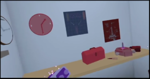
Over the past year or so the Tiltfactor team has been working on a virtual reality puzzle game called “Entangled.” In Entangled, you’re trapped in a room, but you’re able to see a parallel dimension superimposed on yours. You can’t touch things in the other dimension, but you can get things in your dimension to overlap with things in the other dimension, “entangling” them and allowing you to manipulate them across both.
This has been my first term at Tiltfactor and I’ve really enjoyed jumping in to help make Entangled awesome. . Players have found our current prototype super fun, and it has proved promising in the research studies I’ve helped conduct (top secret; we’ll be releasing more information about the studies soon), so my largest task this term has been to prepare the prototype to be transformed into a polished demo that anyone can play!
The first step in making our polished demo of Entangled has be to develop a comprehensive design specification document In order to make this document clear, I divided the game into four key pillars: art, story, mechanics, and UI. I then synthesized all the elements of our prototype into the specifications. Finally, I incorporated playtest feedback into a list of feature changes. However, there was one thing I really struggled with: fixing our visual language.
Entangled is about being in one dimension but being able to see another dimension superimposed on yours. In order to differentiate things in the player dimension from ones in the other dimension and ones in both, we had assigned each a color palette: normal for the player dimension, red for the other dimension, and purple for “entangled” objects which are in both dimensions in once. But there was a problem—the color red in user interfaces usually means “stop” or “bad” (think of stop signs or the “x” that closes your browser). In the Entangled prototype, red walls, which the player is allowed to walk through because they are in another dimension, seem “prohibited” because they are red. Additionally, some of the things that are in both dimensions, like most tables and doors should have, by a strict interpretation of our rules, appeared as purple, so we lacked consistency.
Coherent design language should facilitate gameplay and help telegraph information to the player, and playtesting suggested that the Entangled prototype’s visual design language hindered its players’ understanding of the game’s puzzles. After much brainstorming, I came up with the solution of changing the color of the second dimension to be blue, and making objects in both dimensions be normal color with a red aura. This solves the problem of consistency in design language.
Developing this documentation has been a great opportunity to get insight into the more nitty-gritty details of the development cycle of games, especially since I am interested in the industry but have only ever had an outside perspective.
—
Screenshot from the game, where there is a clock, desk and poster in normal colors and a clock poster and tools in red. How can the red things sit on the desk if the desk is not in both dimensions, and if it is, why is it not purple like the battery in the player’s hand?


